
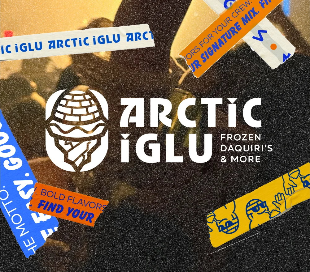
OVERVIEW
For this project, I undertook a strategic rebrand of Eskimo Hut, a legacy Texas-based frozen daiquiri chain, evolving it into Arctic Iglu. The goal was to modernize the brand for a national 2025 audience while resolving cultural sensitivity issues. I executed a complete overhaul including a new naming strategy, a comprehensive visual identity system, and an original mascot, "The Chill Ambassador," to foster nostalgia and relatability with a millennial and Gen Z demographic.
Updated Logo
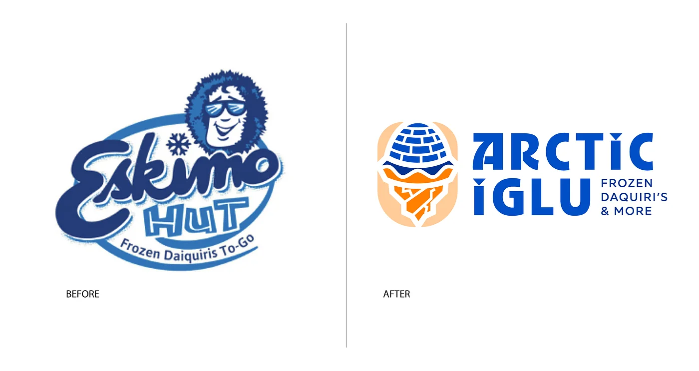
The Arctic Iglu logo was refined by fusing a soft "snowcone" top with a structured "igloo brick" base to create a literal, memorable link to the brand name. I moved away from an overly abstract, "sportsy" aesthetic toward a balanced geometric mark that ensures high-fidelity scalability. This final iteration grounds the brand’s playful energy in a professional, cohesive identity.
Identity System
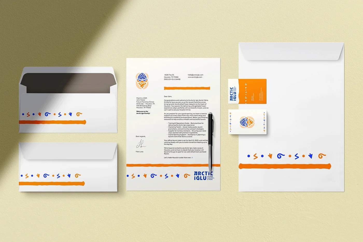
New Franchisee Welcome Kit
This professional stationery suite serves as the first physical touchpoint for new business partners, establishing immediate brand legitimacy. The kit utilizes a clean, professional layout punctuated by vibrant brand colors and decorative borders created from the custom icon set. This suite is intended to provide franchisees with a high-quality example of the cohesive brand they are investing in, setting the stage for a successful national partnership.
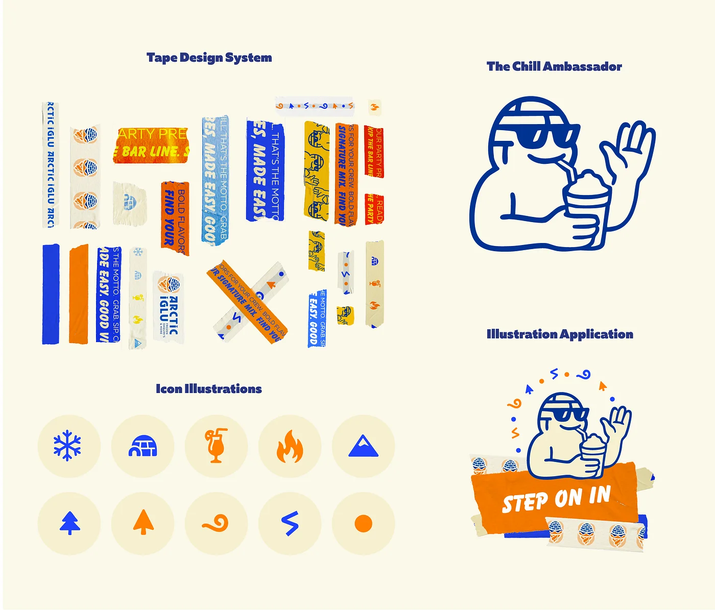
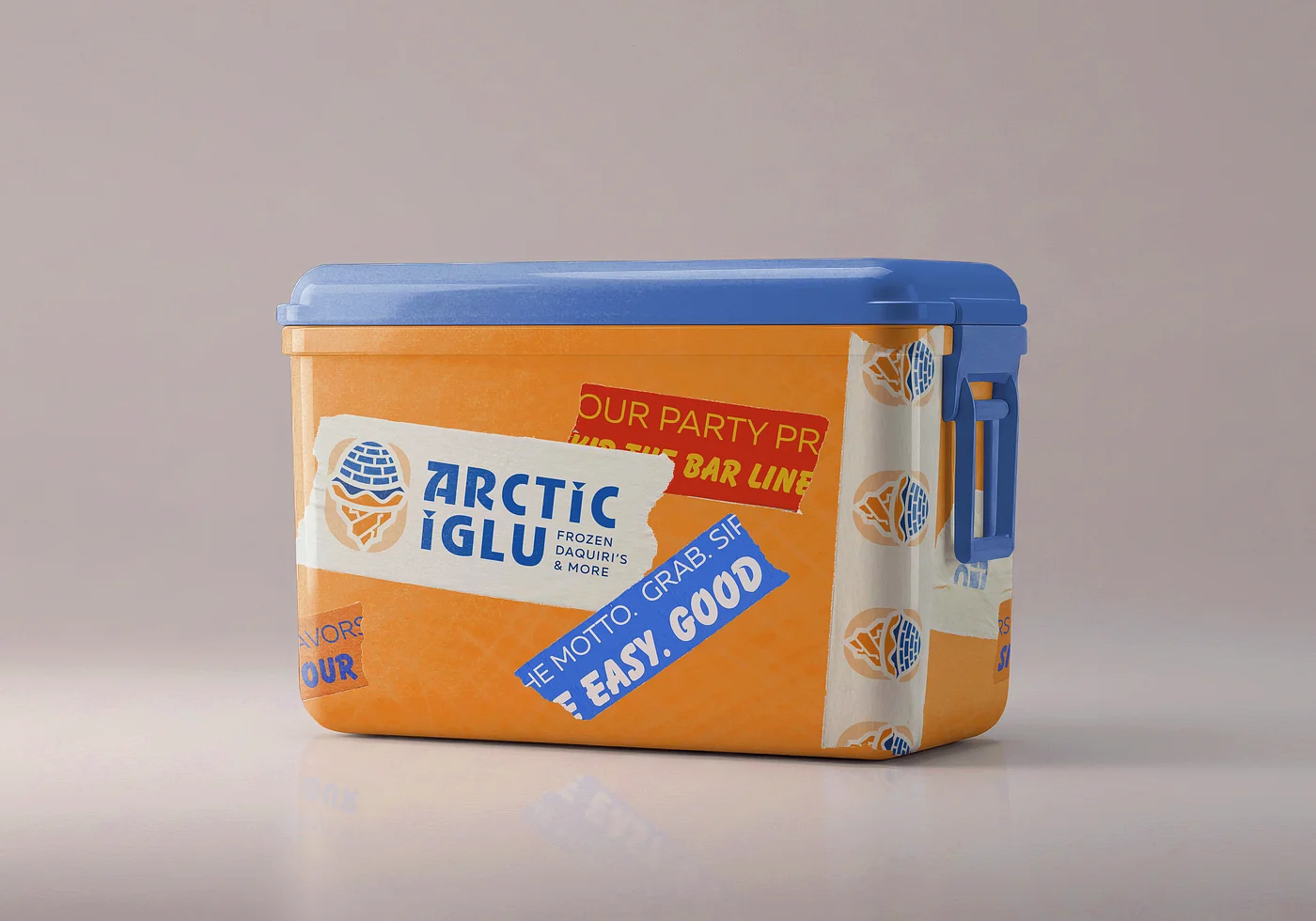
The dynamic tape system is a cornerstone of the brand's application strategy, functioning as a primary visual asset across both digital and physical platforms. Designed as a flexible, low-cost tool, the tape allows individual franchisees to customize packaging and store environments while maintaining brand cohesion. The tape transforms everyday items, like plain cups, into high-impact marketing tools that reinforce the brand's energetic personality.
To give the brand a personable and relatable face, I developed a mascot that personifies the "chill" nature of the company.
The Mascot: Named "The Chill Ambassador," this snowman character features a laid-back smile, sunglasses, and the signature "igloo brick" texture integrated into its design.
Icon System: A supporting set of ten geometric icons (including snowflakes, flames, and cocktails) provides clear visual communication for menus, website navigation, and social media.
Social Media
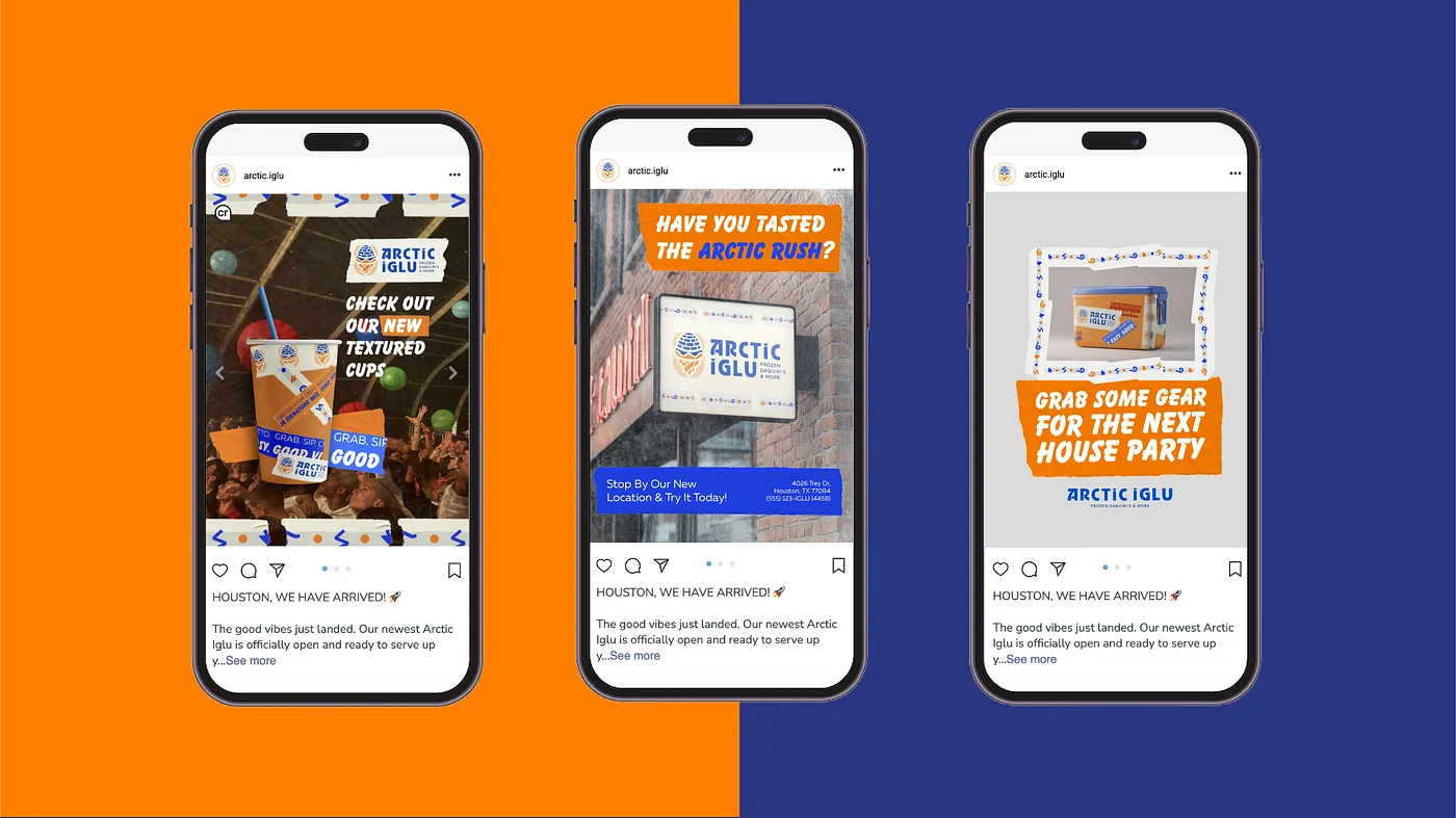
The social media strategy is designed to build an engaged community by utilizing a mix of dynamic lifestyle photography and clean product shots unified by a distinct visual system. The approach focuses on capturing attention in fast-moving digital feeds through high-impact graphic overlays and a consistent "nocturnal" vibe.
Update Storefront & Products
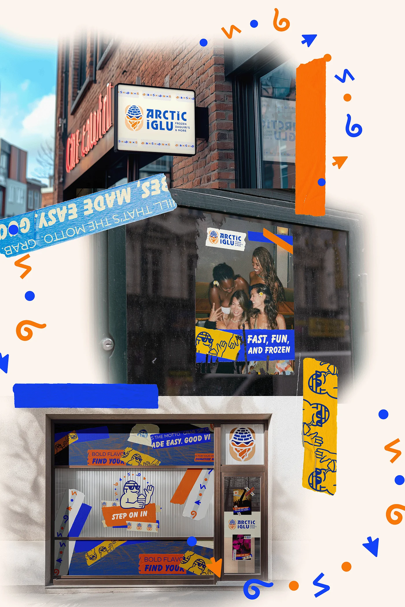
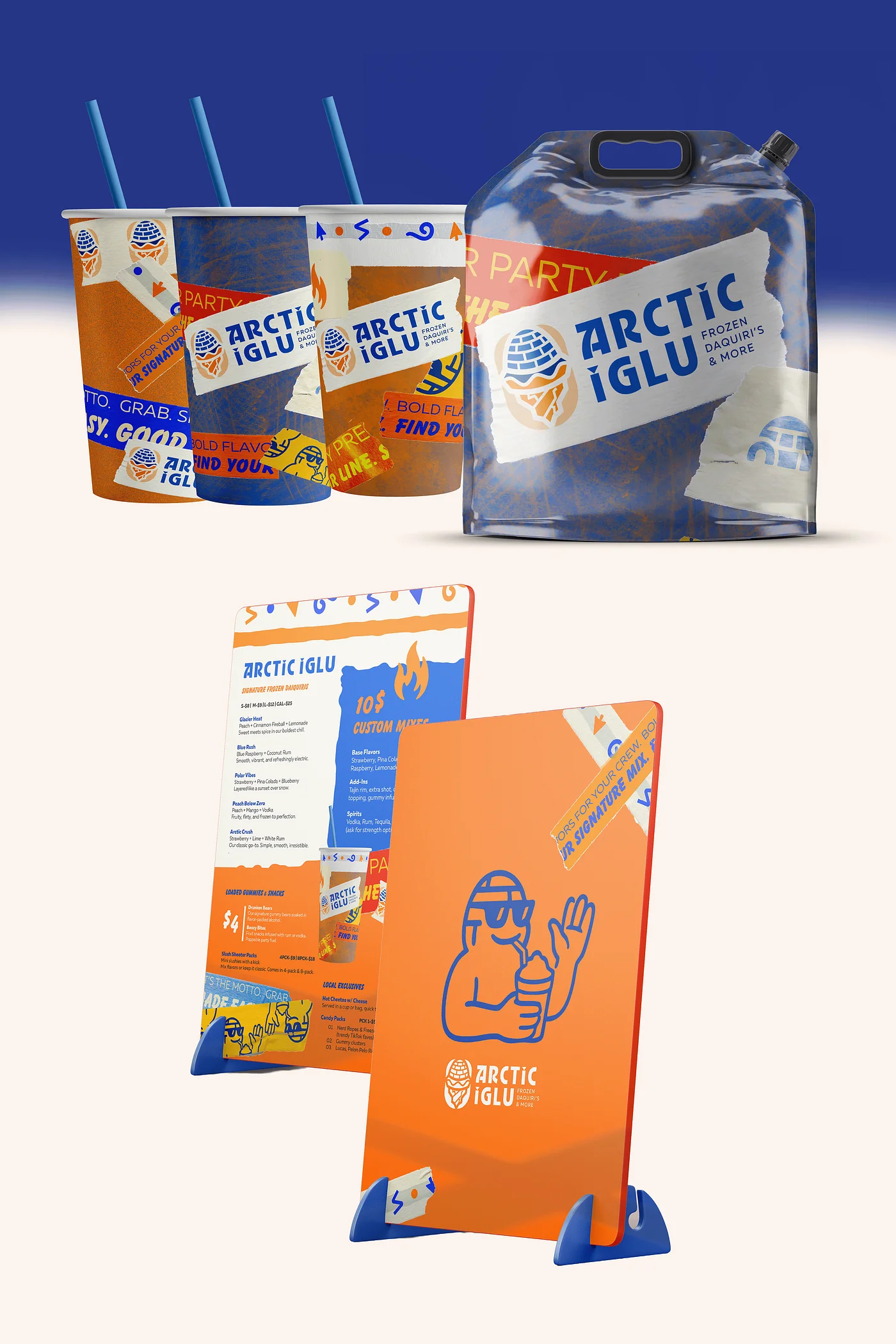
The identity was translated into a physical environment and a versatile product line designed to maximize brand visibility and consumer engagement. The system focuses on turning everyday functional items into high-impact marketing tools.
OOH (Out-of-Home) posters
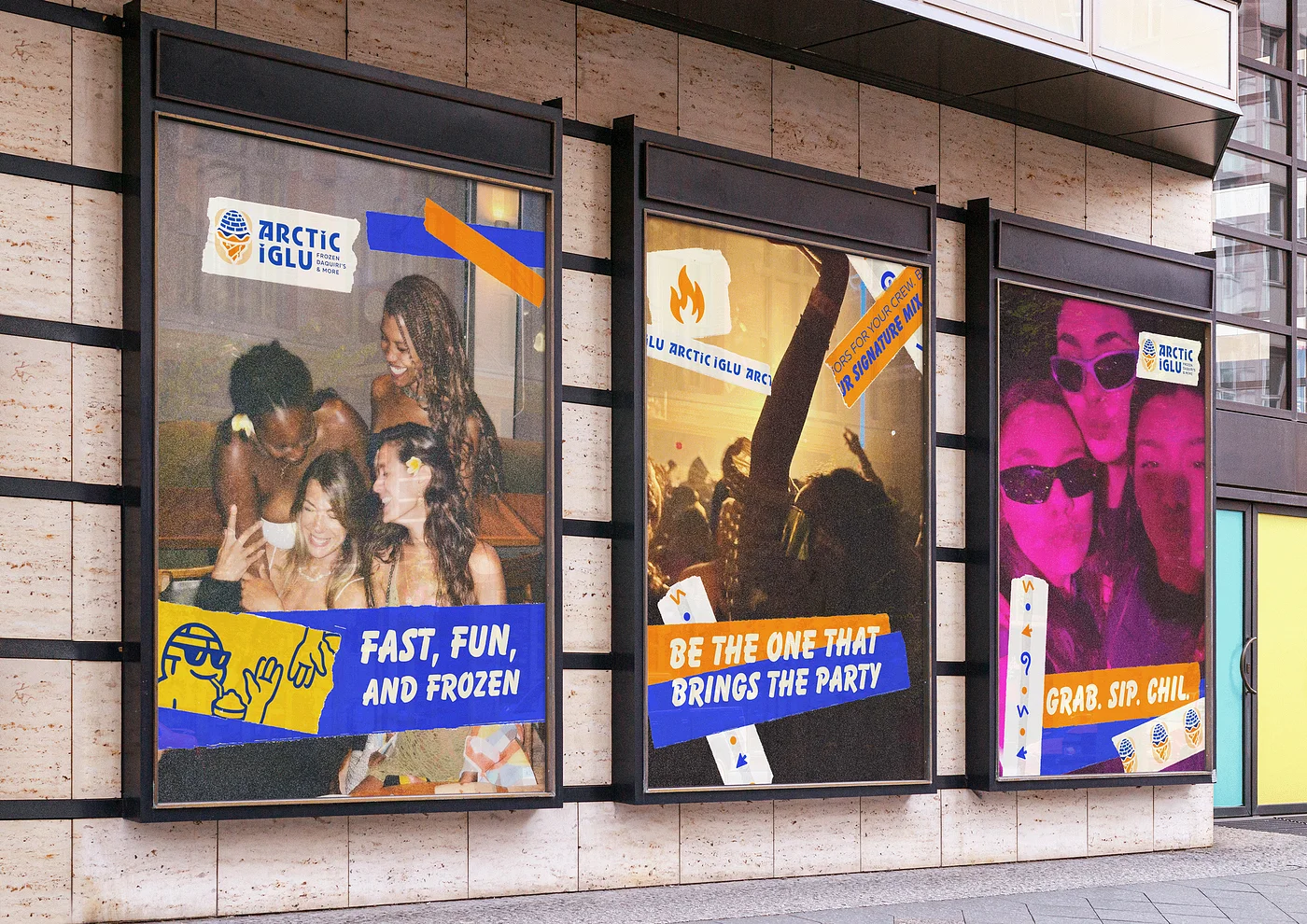
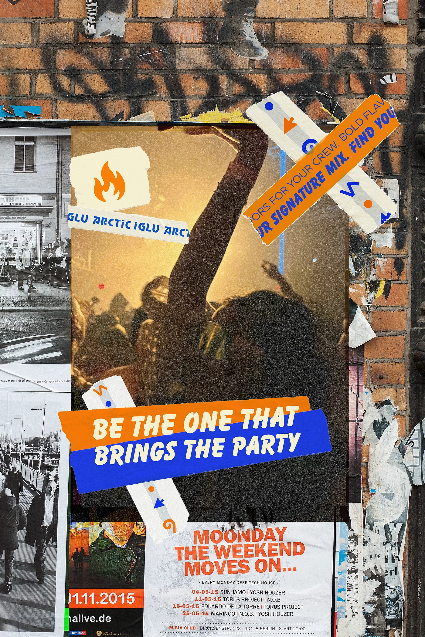
The poster series serves as a high-impact visual narrative that translates Arctic Iglu’s core message of social connection and fun into the physical world. This campaign demonstrates the entire brand system working in harmony to capture the "chill" lifestyle.
Merchandise
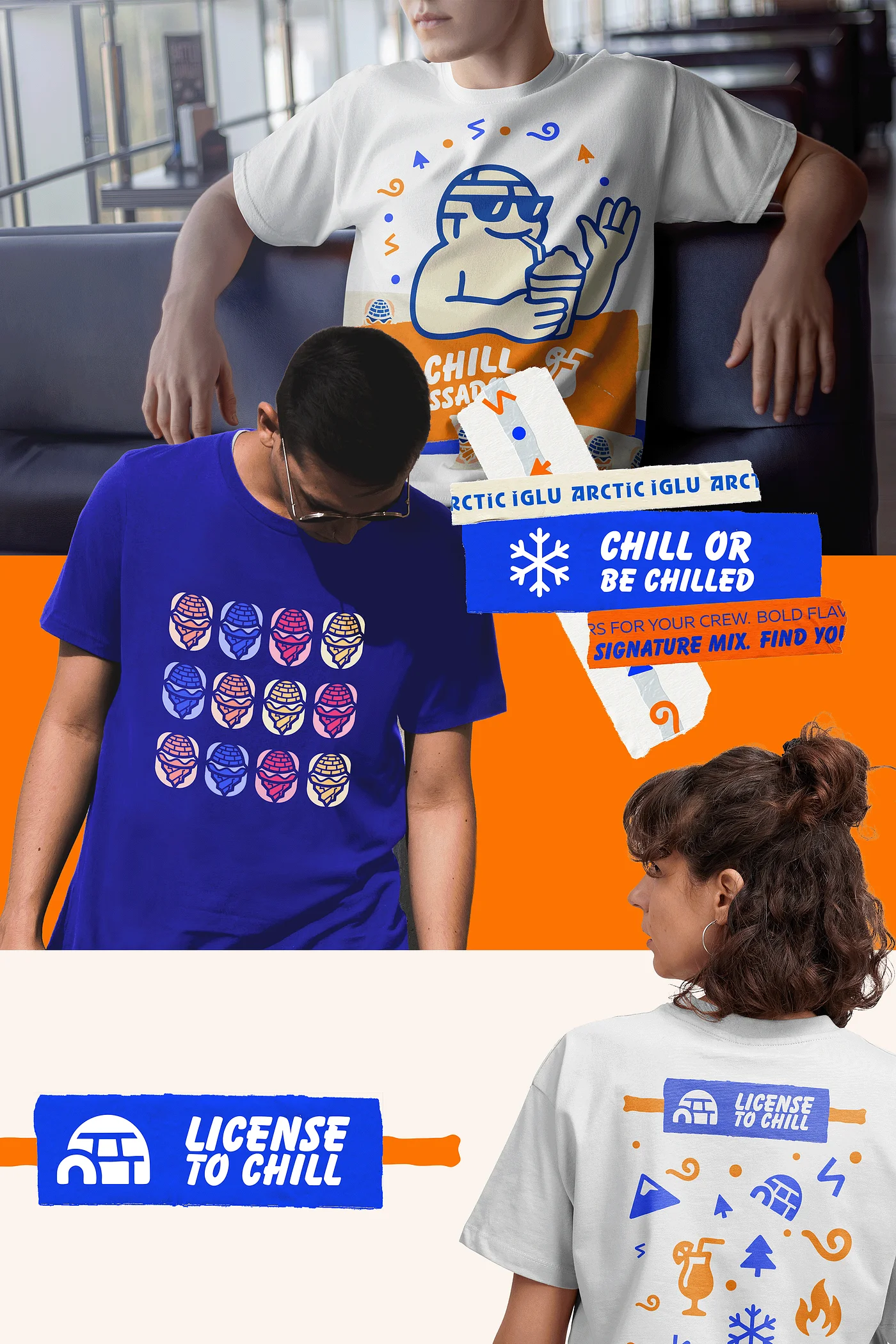
The merchandise line extends the Arctic Iglu identity into the customer’s daily life, transforming fans into active brand advocates through streetwear-inspired designs and functional social gear.