
OVERVIEW
For this project, I was tasked with developing a comprehensive brand ecosystem for Lucid Core, a modular energy drink system designed for cognitive rebellion and deep focus. I designed a full brand world including a robust identity system, physical packaging with integrated AR entry points, and a digital presence tailored for the "digital underground"—night coders, glitch artists, and lucid dreamers.
Logo
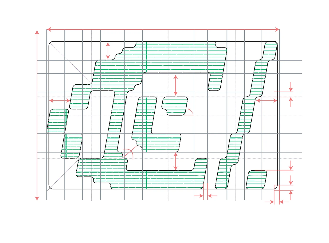
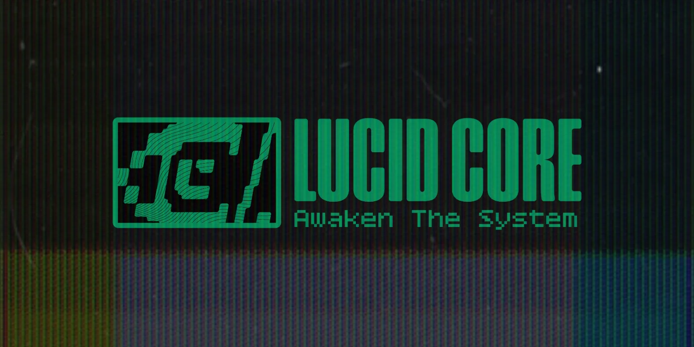
The Lucid Core logo is a "terminal-inspired" visual transmission designed to act as a signal in the static for the digital underground. Rejecting the aggressive, sports-centric aesthetics of mainstream energy drinks like Red Bull or Monster, this mark functions as an internal command menu for those who operate in "dark-mode" environments.
To achieve high-fidelity technical precision, the logo was developed starting on a 9x9 modular grid. the letters "L" and 'C" are hidden with the eye representing the letter "C" and the pupil representing the letter "L".
Identity System
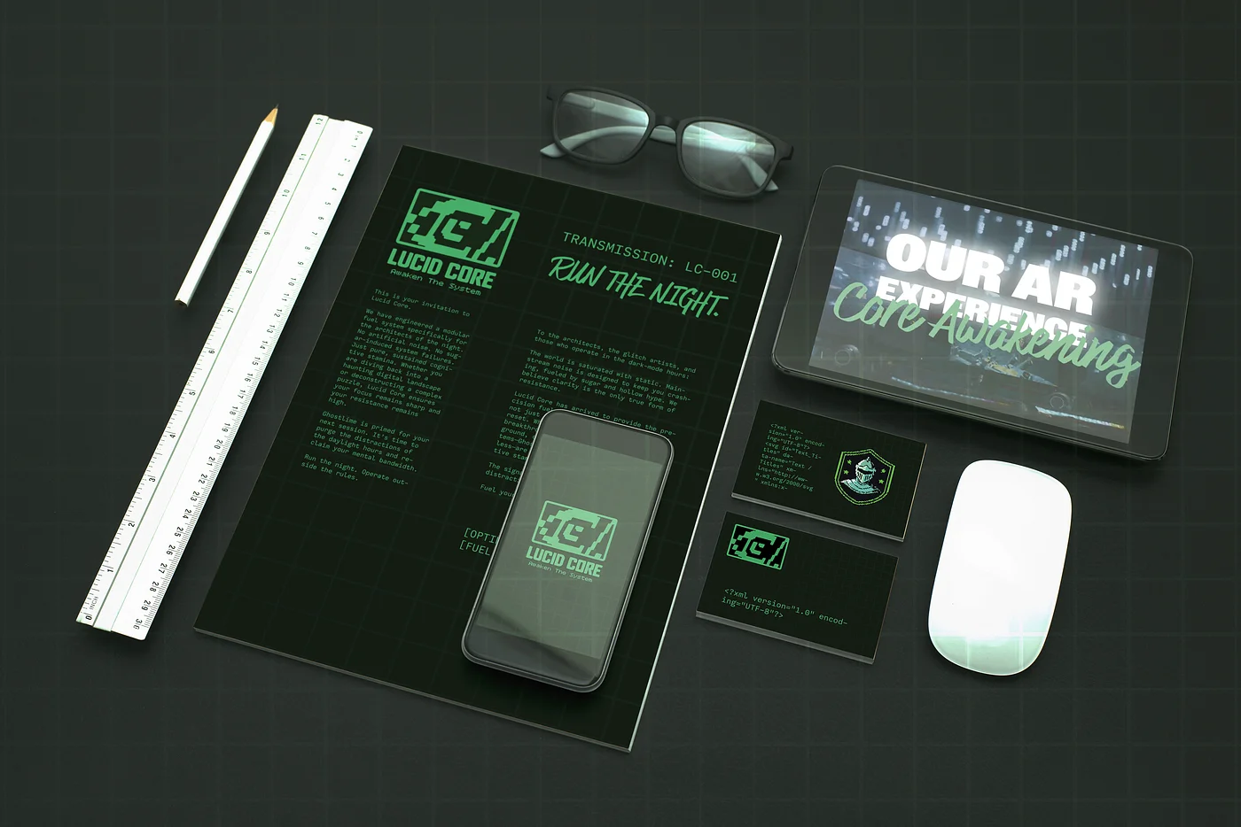
The Lucid Core identity system is engineered to feel like a high-fidelity digital transmission, utilizing deep "Terminal Void" backdrops to create a nocturnal, dark-mode environment. The visual language combines technical precision with "cognitive rebellion," leveraging eyecatching, glitch-inspired typography—such as Inter Regular, Bitcount Grid, and AgencyFB Black Italic—to mimic a voice that "thinks in code, but speaks in art".
Packaging
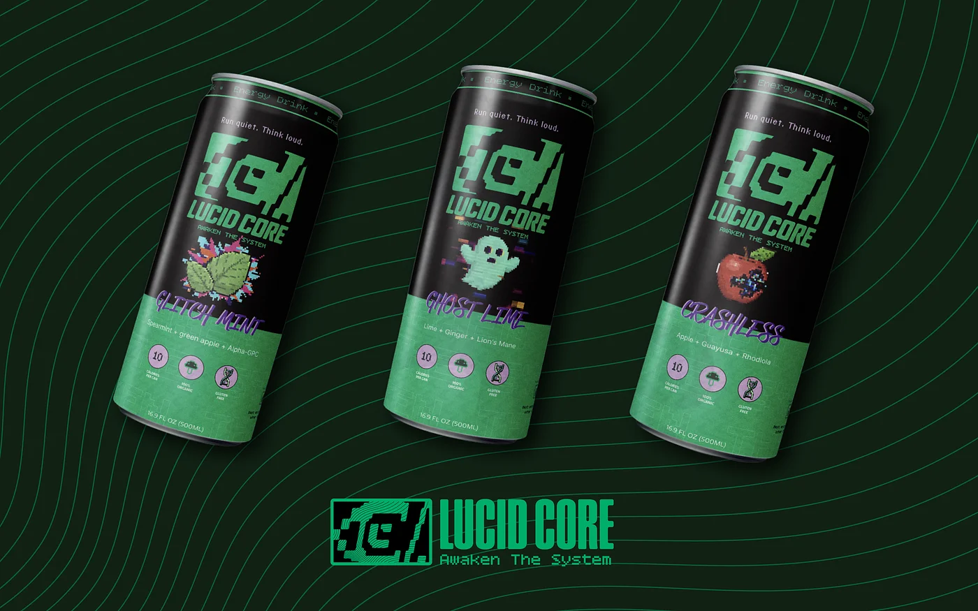
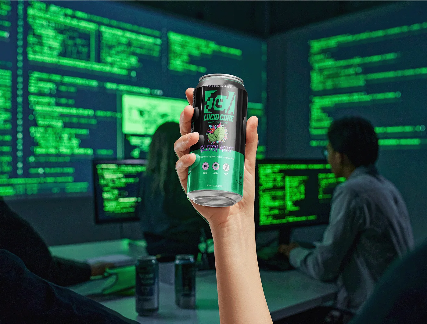
The Lucid Core packaging is engineered as a piece of "terminal hardware" for the digital underground, utilizing a high-contrast, dark-mode aesthetic that prioritizes signal over noise. Anchored by a deep "Terminal Void" matte-black finish, the cans serve as a high-contrast backdrop for "Core Clarity" green typography and technical, grid-aligned graphics. The modular flavor system features pixelated, retro-inspired icons for Ghostlime, Glitchmint, and Crashless, each utilizing nootropics and botanicals like Lion's Mane and Alpha-GPC to support sustained mental focus without the crash. Every can displays clean data—such as "10 Calories Per Can"—and features the "Command Eye" logo, which acts as a functional anchor for a "Core Awakening" Augmented Reality experience. By pairing technical typography with the mythic tagline, "Run quiet. Think loud.", the packaging transforms a standard beverage into a ritualistic reset for architects of the nocturnal workflow.
AI App Development
AI & Human Workflow

The imagery development for Lucid Core utilized a multi-layered AI framework that treated generative models as collaborative partners rather than simple automation tools. To ensure a cohesive transition from abstract concept to tangible brand asset, I implemented a deliberate four-step pipeline where Gemini handled strategic ideation, Adobe Firefly generated visual textures, Adobe Illustrator’s AI tools developed the icon system and at the end I manually added pixelation through photoshop to land on my final concept for the icon system.
To overcome the limitations of generic AI outputs, the workflow evolved to incorporate custom-trained models within Google AI Studio to make a wrapper application that can generate using determined knowledge I provide ie. moodboards, brand guidelines, sketches, and ideas of combonations based on can flavors. Using trained knowledge it was able to take simple ideas and expand on them with the data I provided.
AR Experience
The Augmented Reality (AR) experience, titled "Core Awakening," serves as the interactive bridge between physical packaging and the digital underground community. By scanning the "Command Eye" logo on the can, users unlock a gamified digital layer that transforms a simple purchase into a technical ritual native to dark-mode environments. This experience utilizes high-fidelity digital overlays and system-defined layouts to reinforce the brand's "thinking in code" philosophy, providing night owls and coders with a visual metaphor for the cognitive activation the product delivers. Engineered to function across mobile screens as a "clear signal" in the static, the AR interface effectively elevates the brand from a standard functional beverage to an immersive, tech-driven ecosystem.
Website
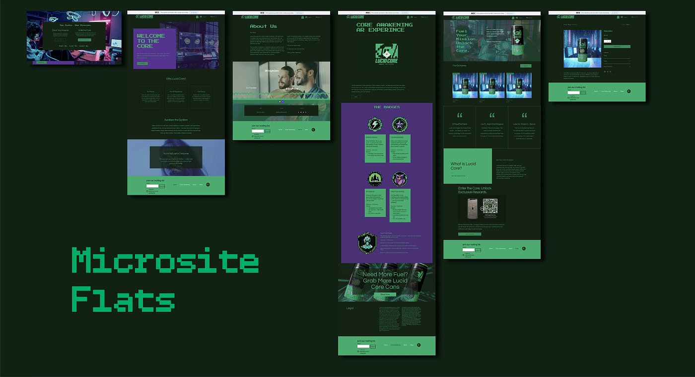
The Lucid Core website is engineered to function as a digital terminal, extending the "signal over noise" philosophy into a high-fidelity web experience. The site utilizes a "dark-mode" UI with "Terminal Void" black backdrops and "Core Clarity" green typography to ensure a seamless transition from physical packaging to digital interface. The layout intentionally avoids mainstream marketing clutter, instead employing eyecatching, glitch-inspired typography and system-defined elements that make the browsing experience feel like navigating an internal command menu.
AR Advertisment
The Lucid Core video advertisement serves as a high-velocity digital transmission that moves beyond standard promotion to gamify the consumer experience. The narrative centers on the "Core Awakening" AR experience, transforming the product into a tactical mission for the digital underground. This "mission-first" approach directly appeals to the problem-solving nature of night coders and glitch artists, making the brand a functional and rewarding part of their nocturnal workflow.